
Kate Spade
In 2019, Kate Spade underwent a massive branding overhaul. Evolving the world of Kate Spade into a new brand while maintaining an elegant but fun ethos synonymous with the brand. The redesign elevated the design while protecting brand equity and looking at a new brand positioning. I was responsible for the execution of a new brand strategy across ecommerce for domestic and global products.
Driving global site design and optimizations, ecommerce initiatives, 3rd party commerce integration, social and paid marketing creative, increased engagement and propelled conversion. My scope included leading creative briefings, and partnering closely with marketing and executive leadership to understand campaign needs and financial goals. Managed a team of muti-disciplinary designers to develop creative that elevated new brand positioning, exemplified design excellence.
Client: Kate Spade
Creative Director:
Elizabeth Spiridakis Olson
Design Director: Maayan Pearl
Branding Agency: Ro & Co.
Branding
The Challenge
1 — Utilizing the new logo and creating a design system that best optimized visibility across print, digital, social and physical products.
2 — Curating a font library that compliments the new logo and create a cohesive system.
3 — Creating a fun shopping destination that not only aligned with the new branding and brand story but also the new e-commerce and social media landscape.
4—Working through the constraints in a antiquated CMS during the initial launch and then create a long term product and design road map.

Website
The Strategy
The first module in the road map was working through bringing all
the new branding elements together and implementing them into the
e-commerce site. The initial high level UI considerations included:
1- Creating a modular yet flexible system that would follow the cadence for regular site design and image refreshes.
2 — The site content refreshed having the ability to refresh weekly while being low lift and reducing custom coding builds.
3 — Overhauling the navigation, product categories, shopping destination, and icon system.
4 — Creative, prioritizing and ensuring a smooth experience across mobile and other devices.

Data & Testing
Discovery
Here we entered the stage of testing across all aspects of the site. Most critically the homepage as the point of entry, the selling pages, and then looking into the rest of the site pages.
The testing process occurred at a weekly, sometimes daily cadence depending on performance and ties to major holidays/events. The in depth eyes on data and performance allowed us to pivot page design, product priorities, and often overhauling campaign imagery/design.
I worked closely with the 360 partners, executives, and my design team to create different content to test when implementing the segmenting site experiences. Aggregating the feedback, analytics, and presenting to the executives our learnings. Ultimately the decisions what to redesign was driven by data that demonstrated the highest conversion, engagement, and click through.

Homepage testing

The Data
We tested initially the landing pages as the major traffic and conversion drivers. Our first test took place during New York Fashion week. One page featured editorial content and the other that was more commercial and shoppable. Our learning from the test that the more commercial pages had higher conversion. However the editorial pages were critical to continuing to build brand equity. Ultimately we decided to keep both as they served different purposes for the brand.

New features
Next steps
The next task in the roadmap after the homepage was bringing those learnings to the PDP pages. The heart of the customer experience and conversion. In testing the PDP pages we were able to focus our efforts and create a priority list of key elements to invest in fixing.

Design
Upgrades
Execution
Through focused testing of the different key elements in the PDP page list,
we were able to identify several critical additions. The first being product video.
This was a big investment. Not only financially but operational adding many more studio hours and the coding time. It also added some more challenges such as dealing with page weight and complex hard coding. Once the feature was launched, we tracked it’s engagement, consumer hover state and conversion. Within a short period of time the data showed substantial growth
in sales.
Some other notable new elements included:
Robust product details that included visualizing the immaculate craft and details of each item. Leveraging and utilizing campaign photography to help bring more editorial context. Payment options with Klarna, store availability and pick up services, gifting registry options, curated product shops, clearer sizing chart, “my hearts” button, and more robust search filters.

Launch Video
Campaign Preview
The Launch
Campaign video previewing the launching the new Kate Spade branding and first capsule collection by Creative Director Nicola Glass.
This preview show cased the new brand ethos and bringing to life the new design motif inspired by the spade into every aspect of the brand.
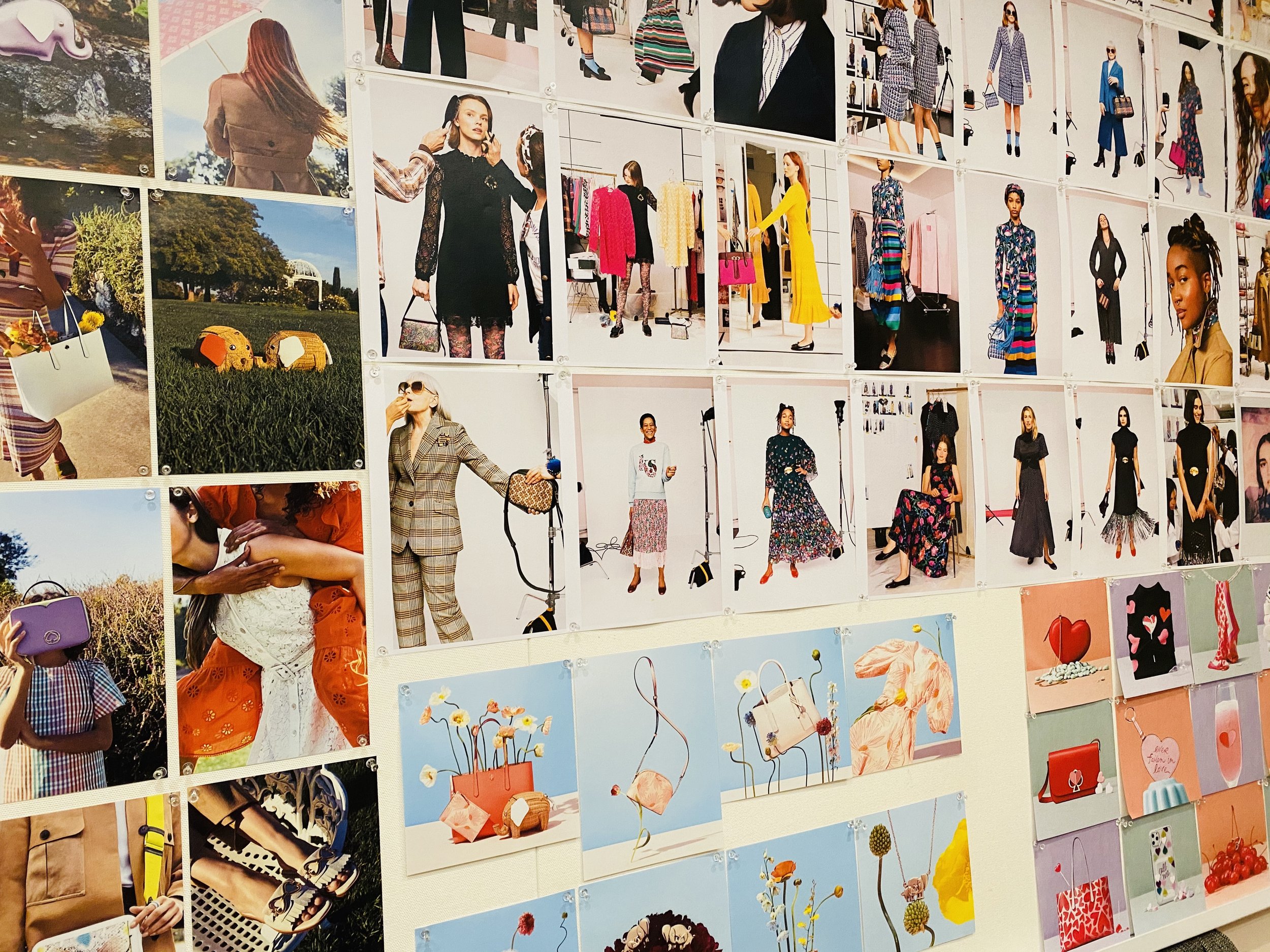
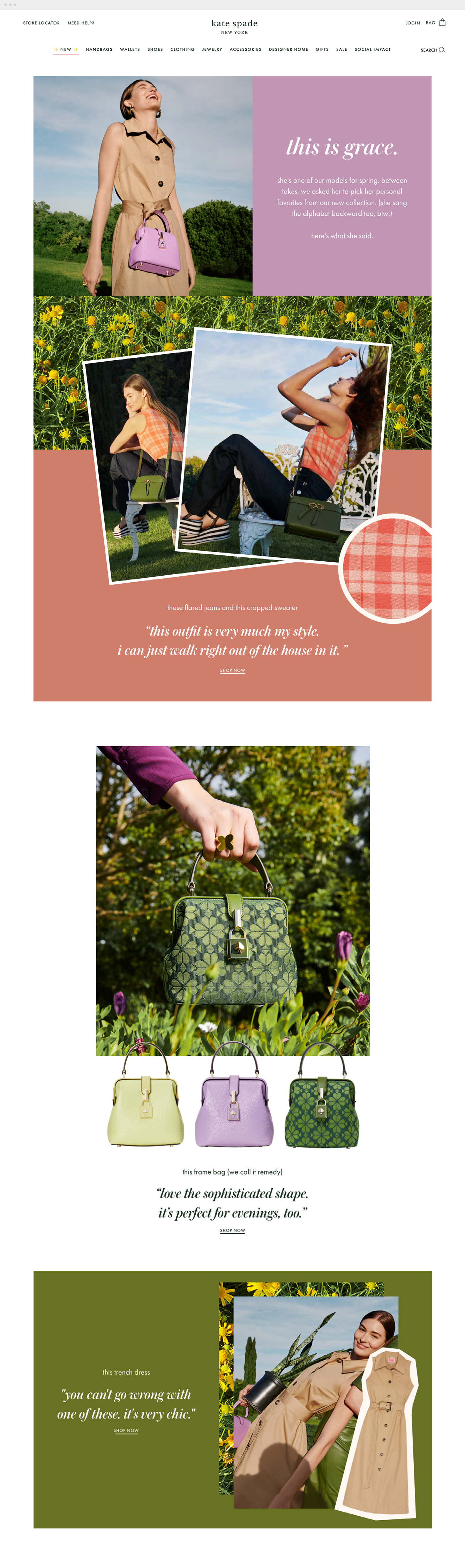
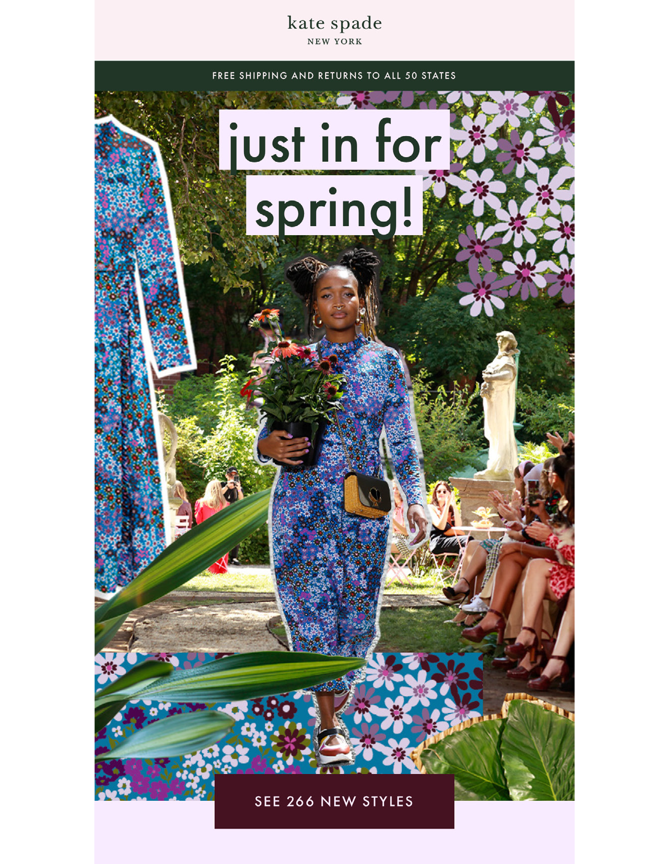
Art Direction
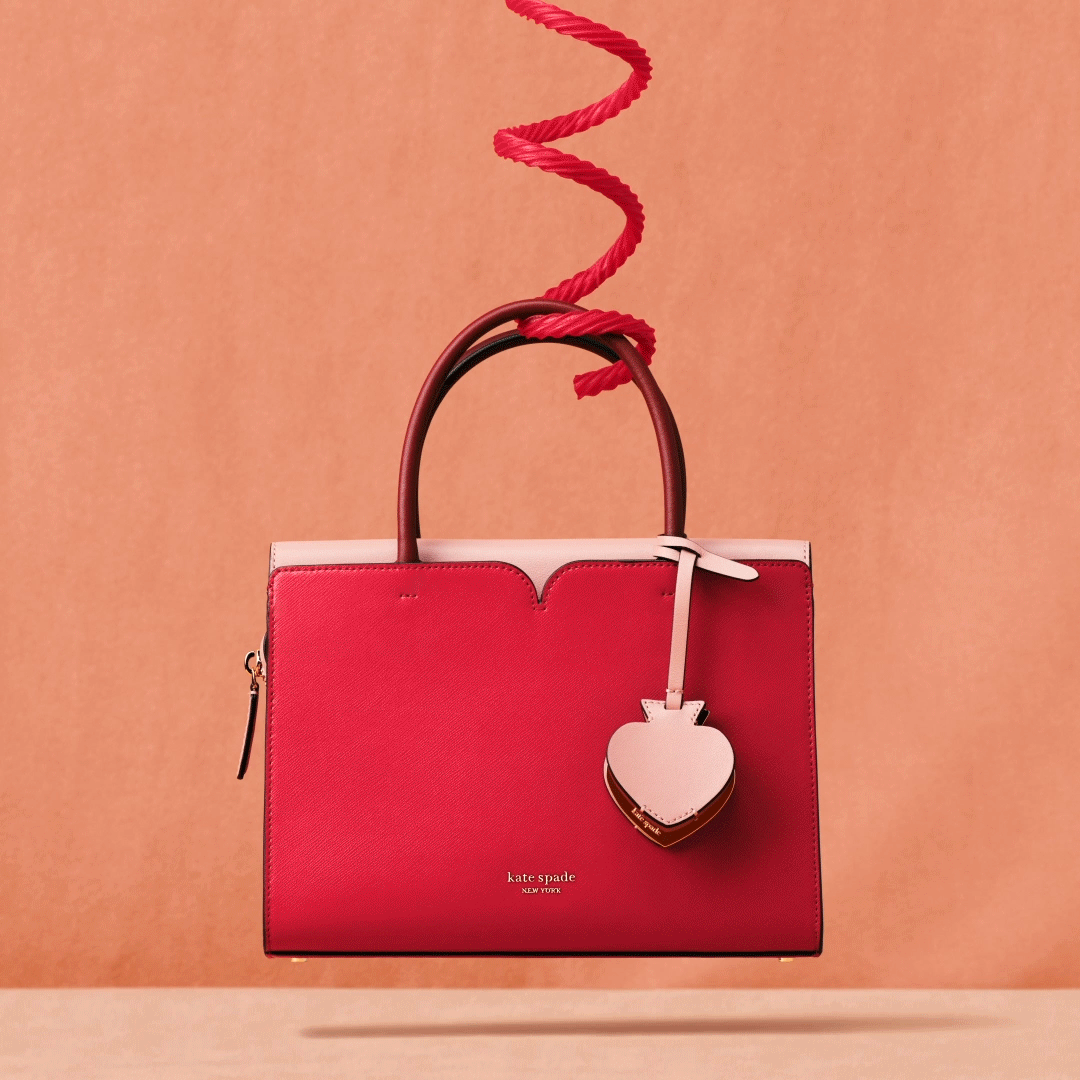
Art direction for Kate Spade’s website, email, store and social platforms. The images took a more natural approach, perfectly imperfect. These assets were included in both global and international websites.


Digital Design
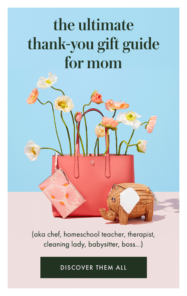
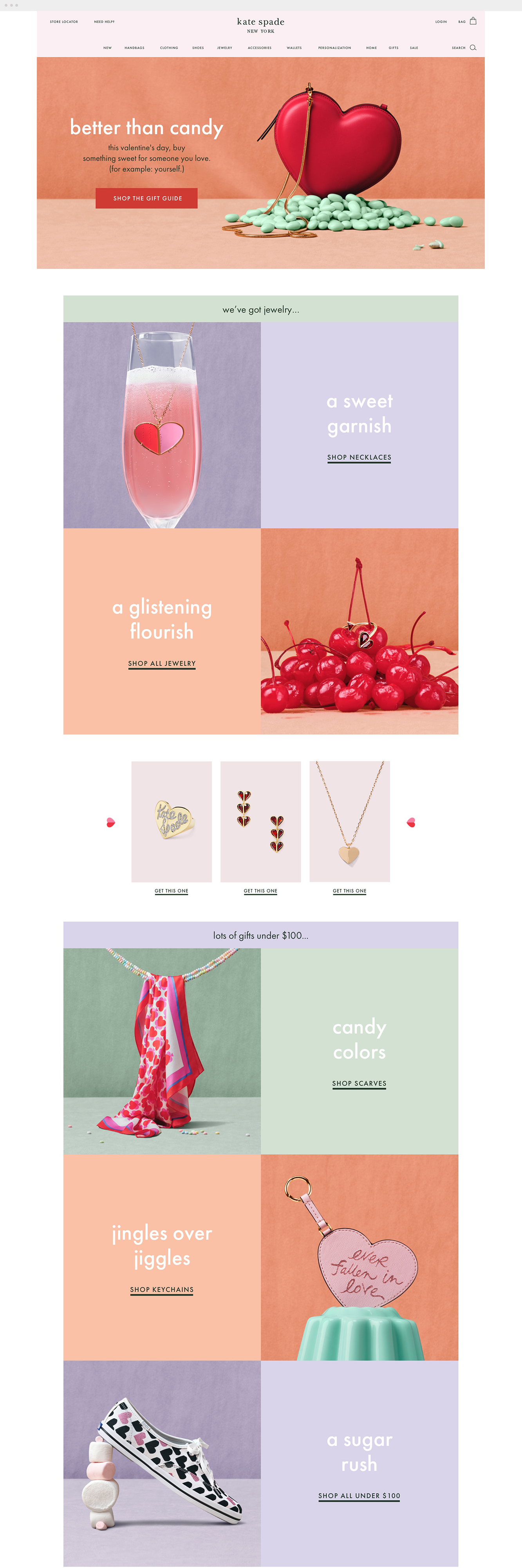
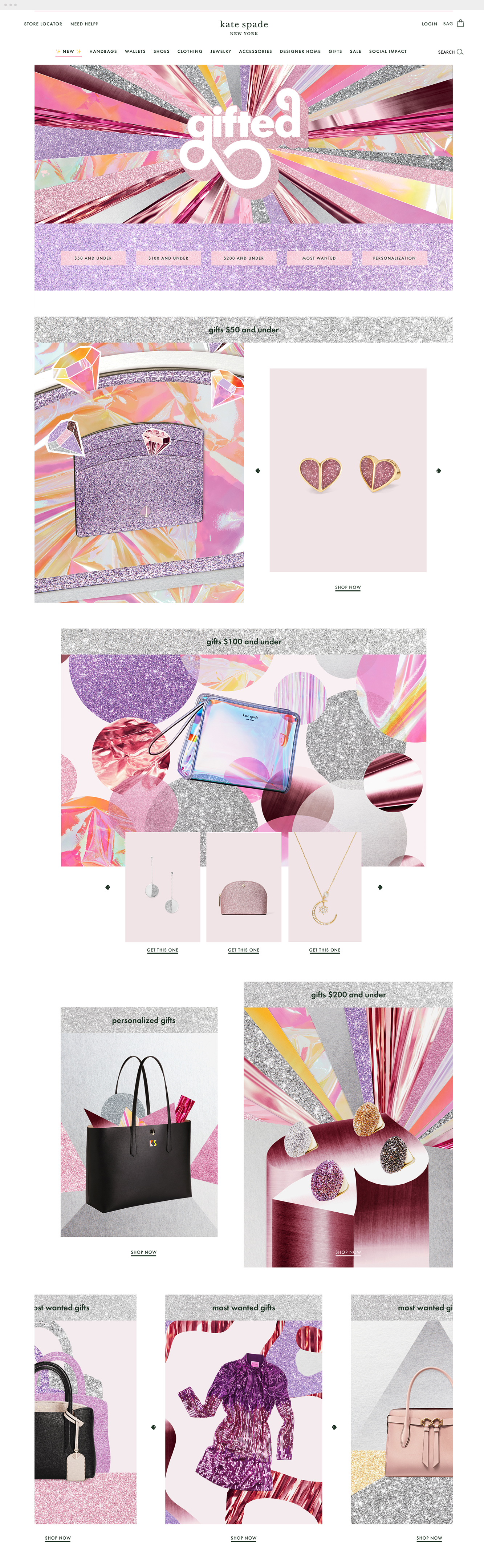
Site and email campaign examples showcasing the new branding and art direction.
Video art direction
Fashion Show 2023
Anna Kendrick was Kate Spade’s spring 2020 fashion show’s spokesperson. We documented her journey meeting Tia (one of our very special customers) and the fun that ensued as they prepared to go to the fashion show.
Behind the scenes with Indra Scott
Behind the scenes with Indra Scott one of the stars in the Kate Spade 2020 spring campaign.
The Margaux
The Margaux bag is back for 2020. The bag launched in new irresistible candy colors featuring Naomi Watanabe.