
Yahoo News
Overhauling the Yahoo News & Entertainment UI/UX, social platforms and visual ecosystem. Bring it up to speed with competitor news organizations. We created a comprehensive guide for the new vision. The north star of the mission being “The world’s best guide to the internet”. Ensuring the consumers visual journey encountering surprises, delights and helping understand the world.
Client: Yahoo News
Executive Director: Nigel Tierney
Creative Director: Ted McGrath
Design Director: Maayan Pearl

The Challenge
Aligning with the brand’s new authority areas as a starting point for guidance. Consider the, company ROIs and KPOs. Looking at prior wins across the news verticals and social channels as a starting point. Auditing the News current aesthetic and process to provide guidance and use them as starting points for guiding the new more cohesive visual identity for the news ecosystem.
While considering a holistic approach to the brand’s visual identity. The new Yahoo News should resonate with the audience on both a cerebral and emotional level.
The new Yahoo News Visuals is visual identity is playful and sharp grounded in Pop with critical thinking informing every piece of creative.
Working in close partnership with the editorial partners on delivering narrative defining visuals for all new formats and franchises.Adjusting and adapting the designs based on performance, customer click through, and site engagement with different type of creative

Branding
The design system is based on the existing Yahoo brand fonts, though we prioritized Yahoo Serif as the hero font, and include a wider variety of weights from the family. This has allowed for a refreshed and expanded take on the “traditional” Yahoo typographic voice. We also explored the use of fonts outside the Yahoo family in new brand franchises and other special projects.
Yahoo News Visuals’ palettes are grounded in pop art as well as contemporary design trends, conveying a broad range of tones and emotions. The palette still adheres to Yahoo’s core purples where applicable, while expanding beyond the Yahoo brand guidelines of accents and secondary colors.

Social Media
Instagram was a starting point for the redesign. Given that the platform was initially the most visual-forward and at the time had the most frequent publishing cadence. These designs were utilized as part of the foundation for refreshes across YouTube, Twitter, Facebook, TikTok, Reddit, etc, while also making sure they connect to the broader visual refresh of the forthcoming Yahoo News ecosystem.
Design Tiers
A 3 prong tier system to allow the social team to create posts independently utilizing a robust set of templates that align with the new brand guidlines.

Tier 1
Premium
Custom images and typography, single posts or carousels with a high level editorial look. Tier 1 would be utilized for social-first posts for hard news and long form articles.

Tier 2
Light Touch
This template utilizes heavily-treated photography, simple illustration or collages. It has a suite of type lock up recommendations and examples but has a more flexible design system that can still tailor to the topic and tone of the article.

Tier 3
Template
A broad array of templates across various subjects and tones, spanning news and lifestyle. The social team utilized the templates with thorough design guidelines that allows them to create posts independently of the design team.

Templates
We created a layout system combining layers of text and imagery over an underlying modular grid. This system allows for a broad spectrum of tonalities and expressions, while keeping the designs clear, readable and evocative.
Using this design system philosophy, and following a thorough audit of competing brands, we created a 3-tiered refresh of the Yahoo News social channels. This refresh leverages the design team for bespoke executions, while also providing the social teams with a robust series of templates for quicker-turn trending and live content. The full palette of templates exist in the master brand guidelines.

Photography
The guiding principle for the new photo direction was simple. Iconic and memorable. Images that speak to the article without looking generic, on the nose or cheesy. Aiming for poignant solutions to difficult topics.
Photos with a more natural, verité quality are prioritized over staged and composed. Not overtreating photography with unnecessary filters, glitches, etc that take away from image legibility. Showing action, or the immediate before or after of said action. Thinking conceptually, and emotionally. Thoughtfully cropping images that can also make a simple image more impactful. Considering the way the image would be cropped into his respective format or template into consideration as well.

Illustration
The approach for social channel illustrations is the “prestige news magazine cover”, providing a high-impact, graphic, easy-read image based on contemporary graphic trends and palettes with tasteful typography for maximum visual punch.
Many of the illustrations appearing on social channels will be sourced from article content and other existing projects. Bespoke illustration will also be created for breaking news posts.
Art Direction
Editorial illustration samples from the 2022-2023 news cycle spanning news, lifestyle, and entertainment.

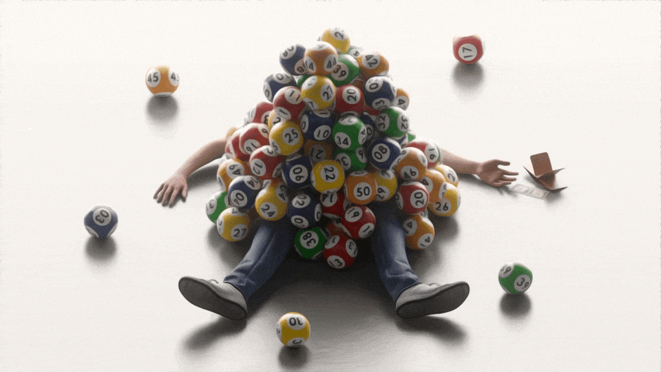
Is winning the lottery all
that it’s cracked up to be?
Illustration by Timo Lezen
Is winning the lottery all
that it’s cracked up to be?
Illustration by Timo Lezen

Felon Voting Rights
Illustration by Matt Chase

Where are we now with COVID?
Illustration by Vartika Sharma

Unlocking Birth control access in the courts
Illustration by Juanjo Gasul

The difficult road to
traveling with a disability
Illustration Ricardo Tomás

The cost of prison
Illustration Carl Godfrey

What’s next with AI
Illustration by Shira Inbar